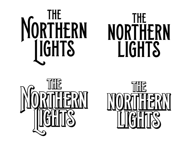
We were definitely getting close with some of these, but they needed to feel a bit more emblematic. By forming an arch with the text, it really
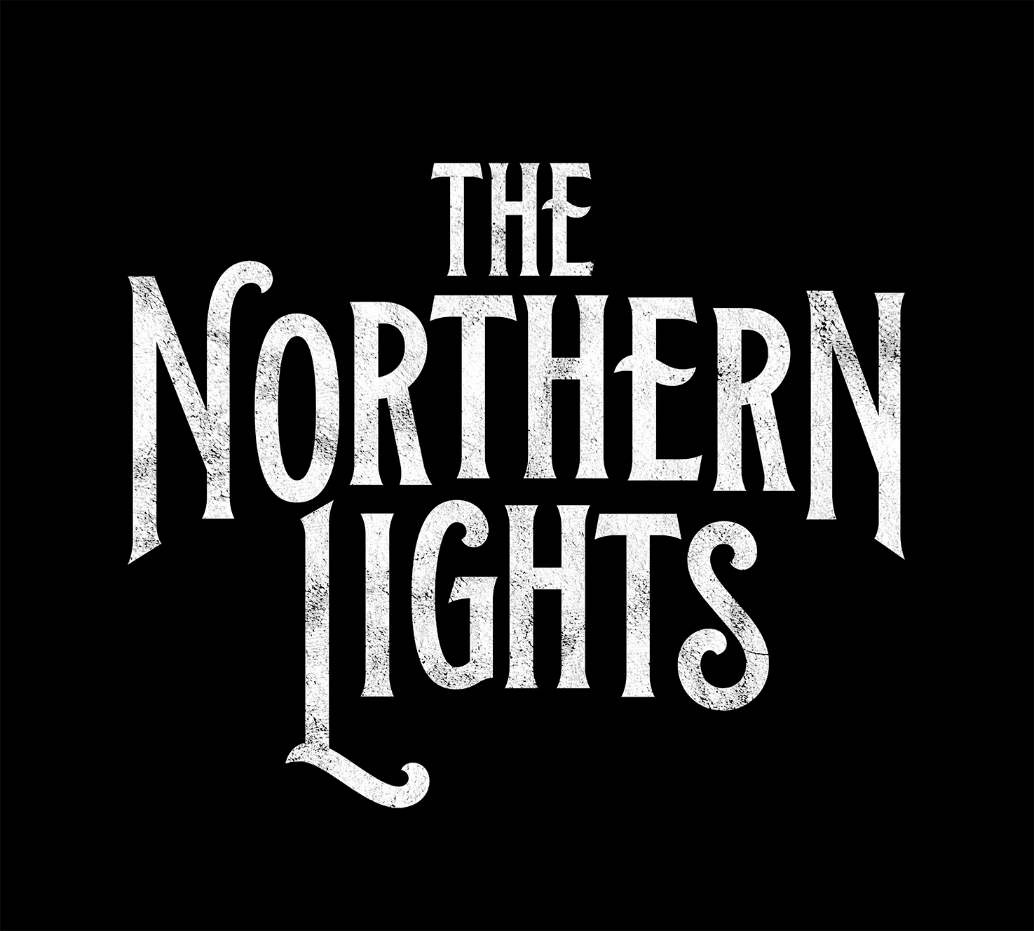
gave it that effect. I customized a few of the letters to make it appear more symmetrical and lo and behold, we arrived at the logo below!
